Introduction
Web accessibility can seem like a daunting task. With rapidly changing legislation always looming on the horizon it is something that many organisations need to tackle. For the uninitiated, looking at the Web Content Accessibility Guidelines (WCAG) (often pronounced as “Wuh-cag”) can leave even the sharpest minds feel like they are drowning in a sea of words.
In the case of public sector organisations there is a legal duty to ensure its website complies with the Public Sector Bodies Accessibility Regulations (PSBAR). This does not only include the website but other online resources, such as PDF documents, made available to the public. Although certain public sector organisations may be exempt from these accessibility regulations ‘all UK service providers have a legal obligation to make reasonable adjustments under the Equality Act 2010 or the Disability Discrimination Act 1995 (in Northern Ireland)’ (CDDO, 2021).
Compliance does not automatically ensure a satisfying user experience for disabled users. Every organisation and business wants to provide a great experience for users of their digital assets. However, unless a website is correctly set up, disabled users will encounter barriers. For example, blind people may use Assistive Technology such as Screen Readers which read aloud the content of a website. Neurodivergent individuals, for example people with dyslexia, might have difficulties reading written content. Without removing the barriers which prevent disabled people from reading, navigating or interacting with online content, the potential audience of valuable digital content is greatly reduced.
Even the most technologically savvy people can be left bewildered by the requirements of web accessibility. From content providers to developers, many have said that they have found the guidelines confusing and verbose, not knowing where to begin or what to ask. To make matters worse, the guidelines are continually evolving. Combine these factors with limited budgets and timescales and the words ‘pain point’ sound like a major understatement.
Simply put, it is important to know where to start and to have clear guidance on your web accessibility journey. The rewards for doing so are enormous and by making your digital assets accessible, you can simultaneously ensure a better user experience for all users. This article will help you to understand why making simple cost-effective changes can significantly improve not only the lives of disabled people but everyone.
The top six failures:
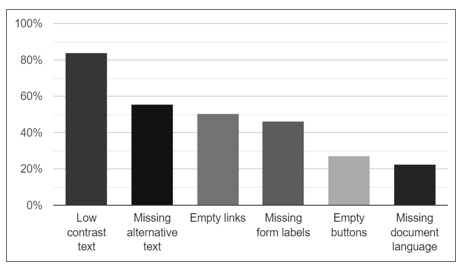
According to the WebAIM Million 2022 report on the accessibility of the top one million home pages, six issues (see Figure 1) were most commonly found:
- Low contrast text;
- Missing alternative text;
- Empty links;
- Missing form input labels;
- Empty buttons;
- Missing document language.
The testing for the report was undertaken using an automatic evalution tool called WAVE. Using multiple tools (other examples include Axe, PowerMapper, ARC Toolkit and Tingtun) is recommended so that results can be compared and double-checked. Each of these six failure types can be automatically detected. However, it is advisable to use a combination of both manual and automatic testing. This is because, on average, automatic testing only detects 18% of the accessibility issues on a website.
Let’s now go through each of these common failures to understand them and show the quick and easy solutions which can resolve them.
- Low Contrast Text
As you will see, low contrast text ‘was the most commonly-detected accessibility issue’ (WebAIM, 2022).
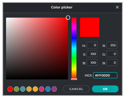
Low contrast text, as the name suggests, is where text contrast is checked, for example, against a background colour. This can be done automatically or manually. You can manually check the contrast ratio of two colours easily using the WebAIM Contrast Checker or Who Can Use in tandem with applications that can provide colour values, such as PIXLR E, when using a colour picker tool, see Figure 2.
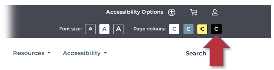
Alternatively, you may wish to use a theme selector tool, such as the one used on the Microlink website, see figure 3. In addition to this, font size also impacts the contrast required. Typically larger bold text requires less contrast and we would usually recommend a body text font size no smaller than 14pt (approx. 19 px).
- Missing Alternative Text
Alternative Text Description (commonly referred to as “alt-text”) is where a description of an image using text is provided so that a screen reader user can be made aware of an images content. When alt-text is missing screen readers are unable to convey the often-vital information and context which an image conveys.
In some instances, the image may be there for aesthetic reasons and does not require alt-text. In other cases, the image may require a more complex description than alt-text is appropriate for, such as an image of a painting used for a university course in art and design.
Another aspect to consider when writing alternative text is to ensure that not only is the meaning correct but also appropriate to the content, something which currently requires a manual check. For example, an image of a tiger roaring would clearly not have the correct meaning if it contained the alt-text ‘dog’. Equally, it would be just as unhelpful if it just said ‘cat’, a technically accurate description but far too broad to be instructive. Automatic tools currently are unable to determine meaning and would pass the alt-text ‘dog’ even though this is incorrect.
- Empty Links
Empty links are links that do not contain text which inform the user where the link will take them to. ‘If a link contains no text, the function or purpose of the link will not be presented to the user. This can introduce confusion for keyboard and screen reader users’ (Web Aim, 2022). To address this issue ‘[r]emove the empty link or provide text within the link that describes the functionality and/or target of that link’ (Web Aim, 2022).
- Missing Form Input Labels
Missing form input labels are when ‘[a] form control does not have a corresponding label’ (Web Aim, 2022). ‘If a form control does not have a properly associated text label, the function or purpose of that form control may not be presented to screen reader users’ (Web Aim, 2022). If a screen-reader user does not have forms properly labelled it becomes impossible for them to know what the form is asking from them, it is therefore imperative to label forms so that screen readers can convey the required information to the user.
- Empty Buttons
Empty buttons are where a clickable button is empty or has no value text. ‘When navigating to a button, descriptive text must be presented to screen reader users to indicate the function of the button’ (Web Aim, 2022). Ensuring buttons are not empty or lacking in value text makes sure that they are functional for both disabled and non-disabled users alike.
- Missing Document Language
Missing document language is where the language of the web page or website has not been specified and may prevent a screen reader from reading aloud text correctly. To fix this simply add, for example, ‘en’ or ‘en-GB’ in the required language tag if the website or web page is written in English.
Conclusion
Having a compliant website may meet accessibility regulations but it does not guarantee your website is useable by disabled people. Imagine a ladder where compliance is the first rung, and the top rung is a website that is fully useable by disabled people. Our aim is to help organisations to not only get to the top of the ladder but to look out over the top and in doing so provide an exceptional user experience.
For example, it would be tedious for a screen reader user to navigate through 100 accessible links listed on a web page to find a required link. If the links are divided into alphabetical groups or categorised logically this enables a screen reader user to find what they are looking for quickly. Indeed, this would benefit all users.
Making simple changes, by addressing the most common WCAG failures to your website, can make an enormous difference to disabled people. For example, by providing the appropriate contrast level for text against a background can help those who have:
- Cognitive impairments, such as autism or dyslexia,
- Visual impairments or
- Visual stress.
Although, by addressing these common WCAG failures the accessibility of the web can be significantly improved, it is additionally important to include both disabeld people and digital accessibility experts in your testing. This will ensure you have a thorough and full accessibility review of your website and it is why and how Microlink has designed the best available digital accessibility service.
Your digital assets, including your website, mobile applications and customer facing formats, such as PDFs, are the gateway to your products and services. Ensuring you make them accessible to the widest possible audience is essential, particularly for the aging population who may not consider themselves as being disabled or for those who have hidden disabilities such as dyslexia. Ultimately, by improving user experience, digital accessibility helps everyone.
References and links:
Web Content Accessibility Guidelines
Public Sector Bodies Accessibility Regulations
Digital accessibility resources – Microlink (microlinkpc.com)
WebAIM: The WebAIM Million – The 2022 report on the accessibility of the top 1,000,000 home pages
- Share: